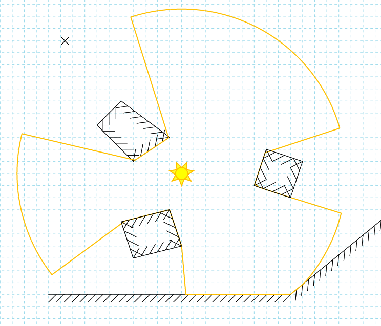
I got tired of looking at the old ‘programmer art’ UI in the Editor, so I spent a bit of time putting something a bit nicer together. I had a look at a couple of ready make JS libraries to use, but in the end I decided to build up the little UI library I was using already. There are lots of good libraries out there, but they’re aimed at proper UI/UX people, rather than C++ programmers hacking some JS together (like I am).
There are still some improvements to come. Now that the UI is looking reasonable and has a few usage tips, I’m going to focus on making some usability changes on the drawing itself. There is a lot of functionality (typically accessed via keyboard modifiers) that isn’t very obvious. The overlay rendering (snaps, visual hints, etc) aren’t very nice either (again, programmer art!). Some of these I will address by having nicer, more intuitive graphics, and others by providing example and tutorial scenes.
