During the Christmas holidays I decided that I’ve had enough of the old editor UI and needed something more functional. I didn’t like the Property Panel taking up so much screen space or the fact that it kept changing size as the number of properties changed. The Object List was also quite bulky and I was finding that most of the time I wasn’t actually using it.
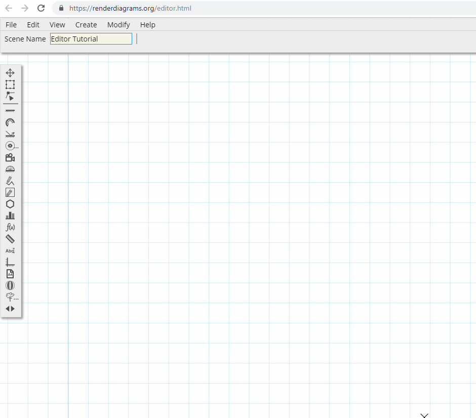
You can have a look at the new editor here!
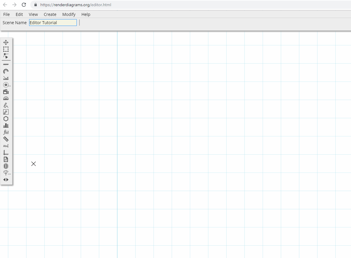
New UI
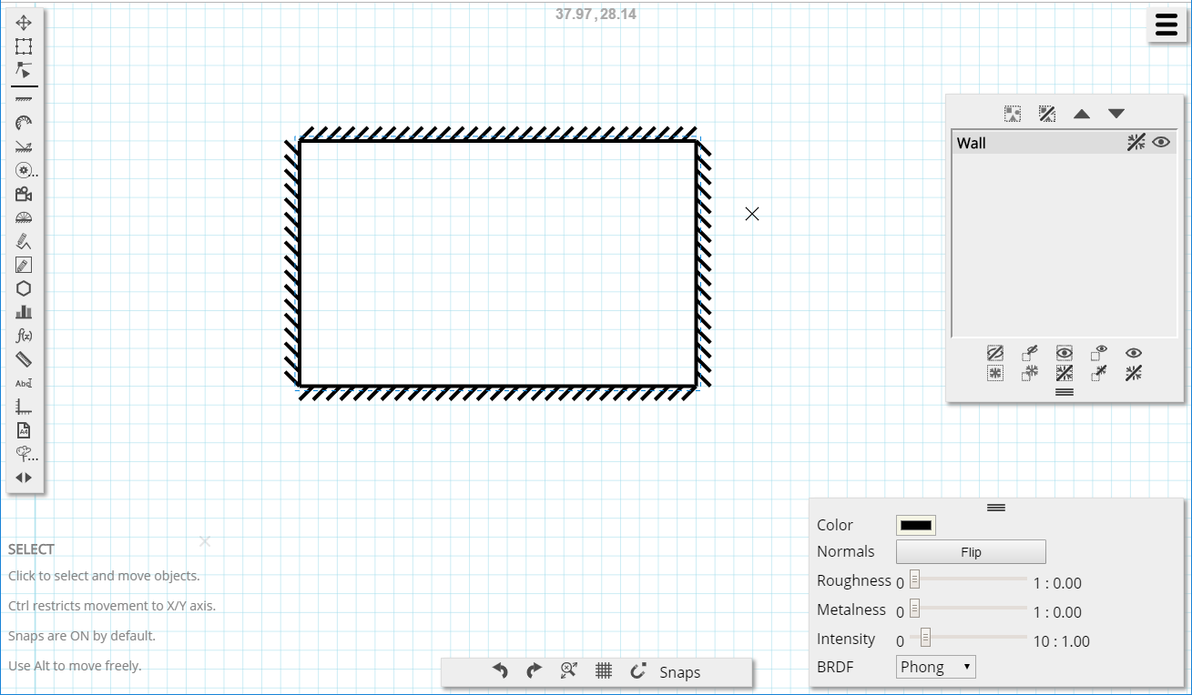
So, out with the old, in with the new! I’ve taken the slightly unusual approach of having a horizontal Property Panel. Most scene objects have few properties and they’re easy to fit on a single row. I also made the property widgets pop out on mouse hover. Again, slightly unorthodox, but most of the workflow is directly on the canvas. The value of the property is always displayed but there is no need to take screen real estate on a slider widget until the user needs to edit the property.
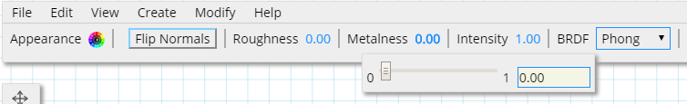
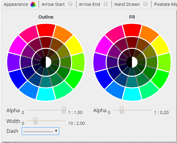
Combining the line & fill properties (color, alpha, width, etc) into a single, feature rich widget also helped to save space, but also to provide a more consistent interface across the various objects.
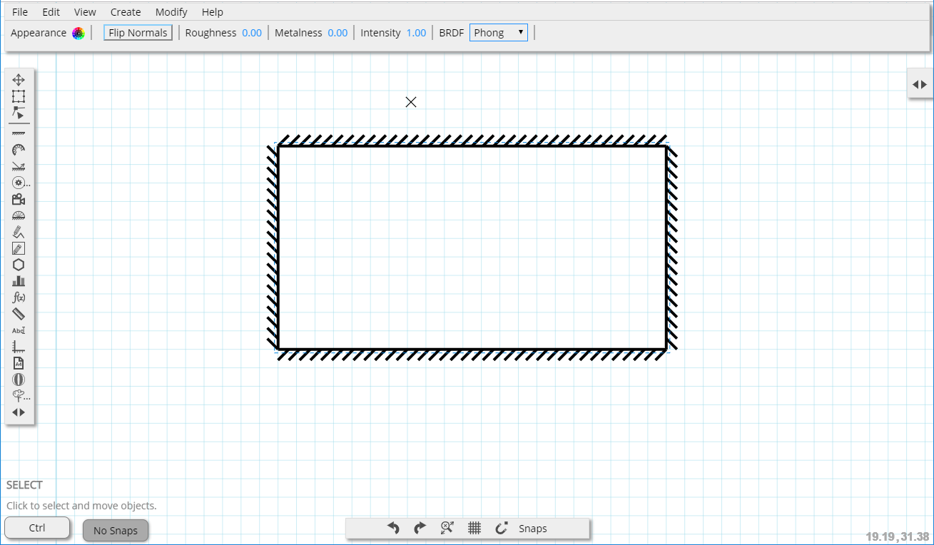
As far as the menu is concerned, I abandoned the original ‘mobile like’ button and went for a traditional top menu bar. It’s given the editor a more ‘desktop app’ feel that I was hoping to avoid, but it’s a convenient and familiar way of exposing a lot of functionality.
My main aim was to free up screen space and keep the canvas as the primary focus. Being restricted to a single monitor/single window can be a bit challenging, but I’m quite happy with the results (for now anyway!). I did look into using existing libraries to do UI and windowing management for me. I won’t lie, a good chunk of the reasons why I didn’t use any was because I wanted to just write it myself. This is a side/hobby project where I can self-indulge after all! There are some good libraries out there (if anything there are too many) but most gave me the impression that I would spend more time learning how to use them than getting the UI up & running. (again, this is a self indulgence project, not pro coding!)
Usability Improvements
I also spent a bit of time making the editor a bit more user friendly and intuitive. The purpose of the tool is to allow the user to create diagrams using an approach similar to pen & paper, using a ruler. It borrows a lot concepts from CAD packages, but also other general purpose vector packages. While a lot of functionality was already there, I was relying a lot on text hints to inform the user of what they can do.
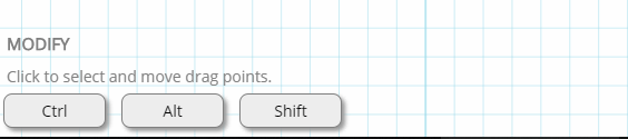
I’ve made a few changes to improve the experience (though there is still a lot to do). You now get a visual buttons telling you what the Ctrl, Alt and Shift keys do in each mode:
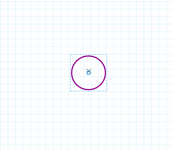
Where possible, I’ve tried to provide visual, in-diagram hints of what the behaviour is going to be, for example when moving with axis lock (Ctrl) enabled:
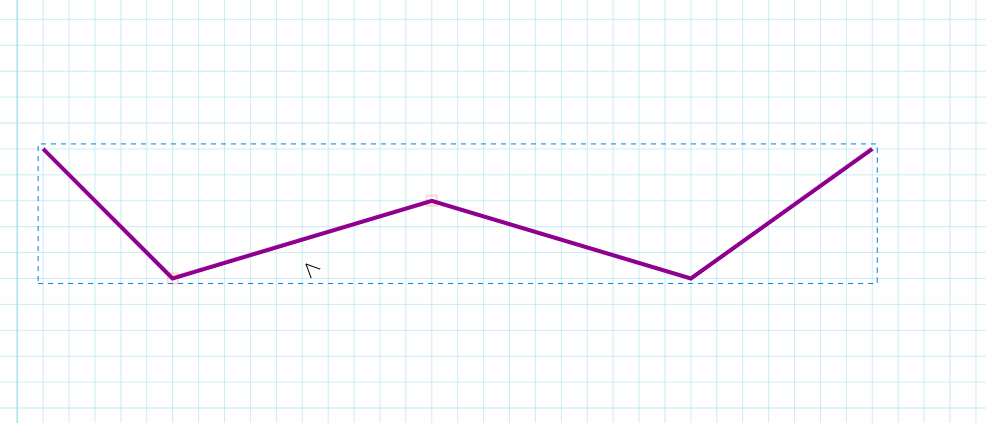
or provide info while modifying an object:
New Objects
I also managed to find some time to implement a couple of new objects.
The first one is a Function Graph. The user supplies the function in Javascript and it plots it as either a Cartesian (XY plot) or a Polar plot.
It’s still early days on this object, so it’s nowhere near the slick implementation of www.desmos.com, but I have high hopes for it! Being able to plot both Cartesian and Polar graphs was really important to me as they both come up quite a lot in graphics theory. More specifically, I find that some concepts I can understand better as an XY plot, whereas others are more intuitive as radial graphs.
I’ve taken the same approach as on the Bar Chart object, where the user is expected to type in Javascript code for the function. This obviously very programmer oriented, but that fits in well with my intended audience. The editor is there as a supporting feature of the blog and is very much aimed at graphics programmers and technical artists. Providing a more user friendly interface for the functions would take up a significant amount of time and, I think, would actually make it less intuitive for technical people.
The other object I implemented is a bouncing ball! Why? Because it’s fun! There a few different ways I want to develop this. Some educational, for example provide a ‘Trajectory’ object similar to the BRDF Ray, where it will show you how a projectile would bounce around the rest of scene, under the influence of gravity and other forces. Others more fun, for example I wouldn’t mind implementing an “I’m bored” mode where you play ‘keepie uppie‘ with the scene geometry!
Future Work
As always there are tons of stuff to do and very little time to do them in! One of the major drawbacks at the moment is that the scene objects don’t store or use any form of transform matrix. This makes some forms of manipulation difficult or impossible. There is a ‘Transform’ tool at the moment but, to be honest, it’s pretty awful! Having a general purpose transform matrix that lets me apply scale and rotation would make things much simpler and intuitive.
While working on the editor I’ve also been making some notes on new blog post ideas. There a quite a few areas that I’d like to write about but time is sparse!